Anesthesia clinical partnerS
logo & brand design
Concept & Inspiration
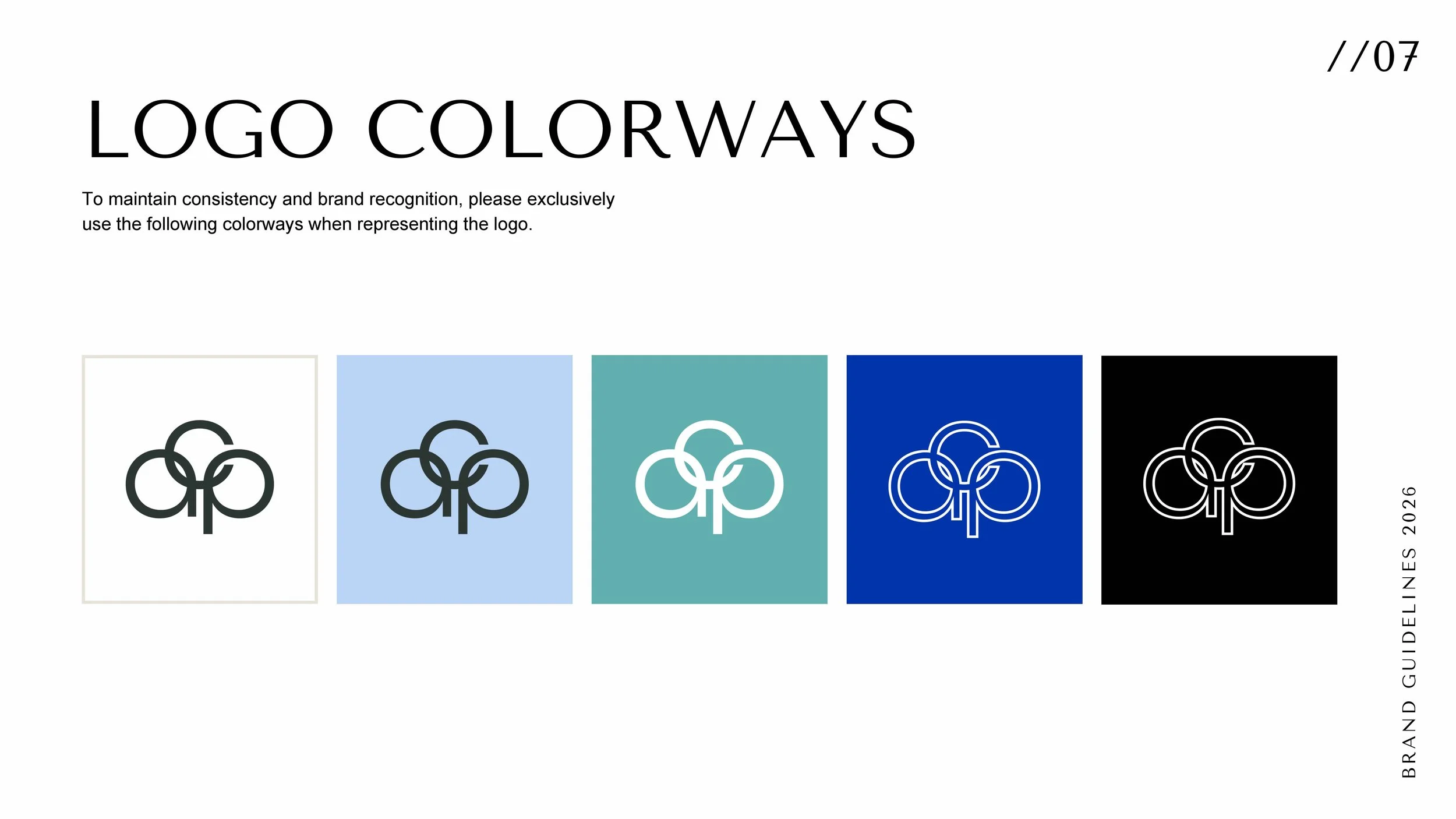
Anesthesia Clinical Partners (ACP) is a specialized staffing partner dedicated to elevating clinical standards for ambulatory surgery centers. This project required a polished, trustworthy brand identity that communicates reliability, safety, and operational efficiency. The visual system was designed to feel distinctly professional and composed, utilizing a classic, clinical color palette of deep navy and vibrant teals to evoke a sense of calm, expertise, and dependable partnership.
Process
Research & Positioning: Defined a brand strategy centered around ACP's core values: safe care, efficient operations, and exceptional service. The goal was to establish a brand voice that felt authoritative yet approachable for medical facilities.
Logo Development: Designed a primary logo featuring custom interlocking typography where the letters cleanly connect, visually representing trust, unity, and seamless clinical partnership. The mark balances professional medical authority with a sleek, contemporary aesthetic, ensuring high legibility while scaling effortlessly from digital headers to printed brand collateral.
Brand Guide & Social Strategy: Produced a full-scale brand guide detailing the clinical color palette, primary and secondary sans-serif typography, and logo usage rules. This included curating an image library focused on bright, clean, and authentic medical environments to maintain visual consistency.
Final design
The finalized identity equips Anesthesia Clinical Partners with a refined and highly professional visual system that builds immediate trust within the medical community. The modern logo and cohesive brand guidelines ensure that every touchpoint—from digital presence to internal documents—reflects their commitment to exceptional care and strong, long-term partnerships.
Role: Created at Advantage Marketing. Responsible for concept development, logo design (primary and icon), and full brand guide creation, from research through final production.